When people say they don’t like to put labels on things, we’re not really sure what they’re talking about. Labels are great, they’re important, they’re our passion. To see our spirited label work firsthand, you needn’t search further than the brand we crafted for the newly launched Harleston Green Scotch.
Harleston Green, the scotch’s namesake and inspiration, was the first golf course in America. The course represents the melting pot of America at its best—a true blending of cultures, geographies, and philosophies. It also, no doubt, played host to a myriad of strange conversations and the dutiful consumption of an unfathomable amount of scotch.
To capture the spirit of the golf course’s period of origin, our Art Directors explored a variety of typographical and illustrative styles unique to the period. Oil paintings. Wood block prints. Cigar-style labels. Etching. Early iterations of the label were built heavily around the game of golf, with some taking the form of items like golf course score cards.
There was a fine line to walk. Scotch is a classic, it typically embodies a more experienced and wizened aesthetic, but Harleston Green is a new sort of scotch, one that eschews the stoic solitude of typical scotch brands for a more versatile and social-friendly feel. Similarly, while a golf course lived at the heart of the brand, this needed to be a scotch inspired by the spirit of golf, not a golf-specific spirit. Got it?
There were plenty of considerations beyond these conceptual ones. Label materials, gilding, ink type, bottle shape and size. Every detail was carefully chosen to embody the product and period perfectly. The types of bottles, materials, and aesthetics you’d find for a scotch at an eighteenth century golf course differ greatly from those for a rum at an eighteenth century dock. Same time period, but context is everything. Devils, details, etc.
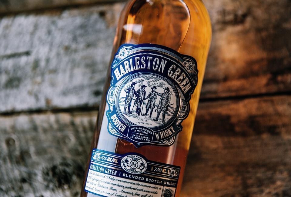
The result speaks for itself. The label’s engraving of four players illustrates the inherently social nature of golf and of drinking Harleston Green. The type and gilded details evoke a specific period while the navy blue subverts it, bringing a splash of color to a category that too-often revels in khakis, ambers, and tans. It’s a design that communicates that Harleston Green is scotch to play with, to gather around. It’s a label inspired by a beautiful, timeless game.
And yes, it tastes as good as it looks.