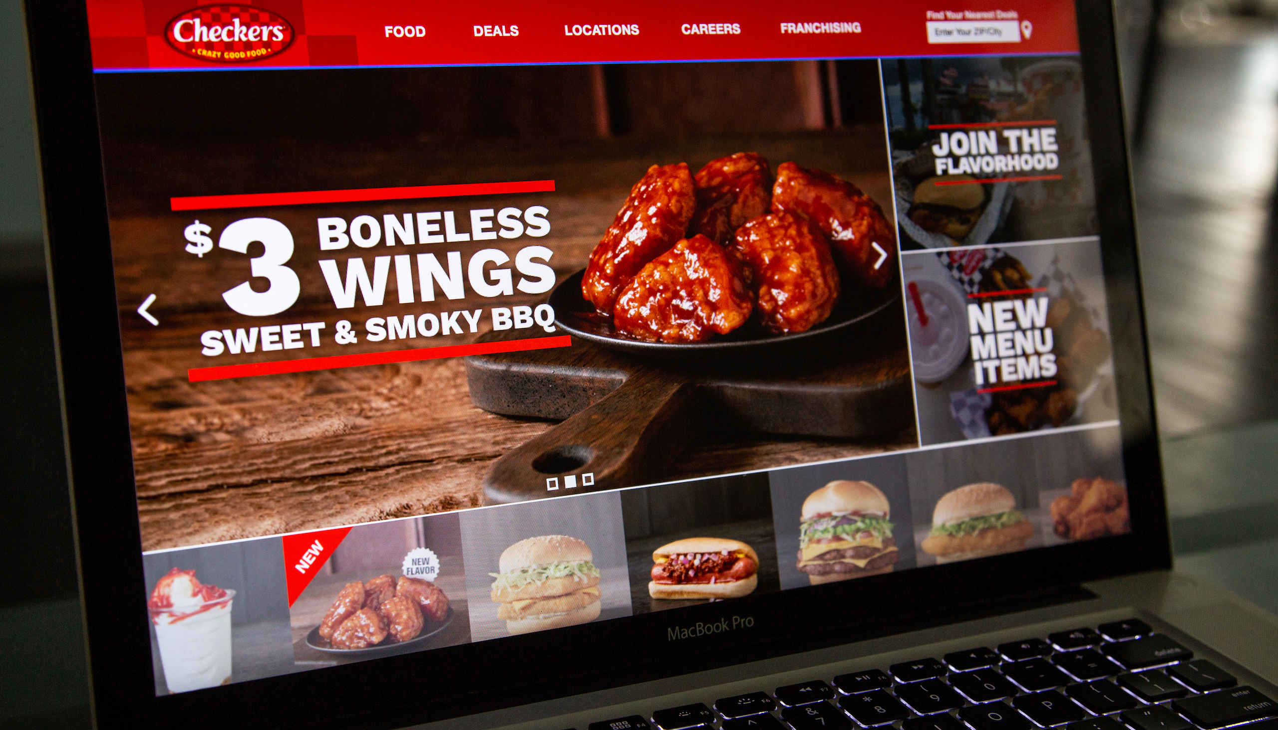
How do we bring bold flavor and value into the digital world? Inspired by convenience, diners and drive-throughs, Checkers and Rally’s is a fast foodie favorite. They approached our team with the challenge of creating a new, bold, juicy and appetizing website that would better represent their brand in the digital world. "We offer big, messy, juicy items and we want our website to reflect it," they said. “It’s called flavorhood." The first step was to bring their irresistible food appeal front and center. We accomplished this by focusing on big item photography on darker backgrounds to make the ingredients really stand-out. We modernized design elements to represent that tactile beauty of their physical drive-thrus and urban cool. We know our audience looks for value and convenience, so we utilized a UI design that was simple and streamlined for a smooth user experience. Easy store locators, clear offers and bold headlines were all used to give the user a quick hit of boldness to direct the user to what they really want: a nearby store and a great, juicy burger for the best price.
Once the flagship sites were rebuilt, it was time for Checkers and Rally’s to tackle the franchise websites so they could attract entrepreneurs, brokers and developers who are ready to turbo charge their futures through franchise opportunities nationwide.
Knowing the site would likely be the first impression for would-be partners, we made it our goal to ensure that it would be modern, responsive, user-friendly and visually impactful, which also meant new photography, which we shot with our Dunn Studios team. Modularity is a key feature of every franchise location build-out, so we incorporated a bit of that into the 12-page site’s structure as well. Above all, it had to explain just how easy it is to get in on the Checkers and Rally’s action, which we accomplished via a custom step-by-step infographic.
Our thanks to everyone at Checkers and Rally’s for continuing to be a great partner to work with. Future franchisees, start your engines.